Power BI HierarchySlicer
Hierarchyslicer
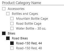 The HierarchySlicer for Power BI provides the opportunity to simple select multiple members of different levels of a hierarchy as selection. The slicer can be used with an existing hierarchy or a manual created hierarchy.
Example
See here for an example if the embedded version is not working.
Data Fields
The HierarchySlicer needs data it a specific way.
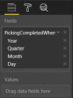 Fields - These fields are the base of the hierarchy. Each field will represent a level in the hierarchy
- Values - With a value it is possible to (pre)filter the hierarchy to show only members that have a value. Typical scenario: filter a product/category hierarchy with sales. The values are not shown in the visual
Selection
With the selection option the behavior of the hierarchy can be changed
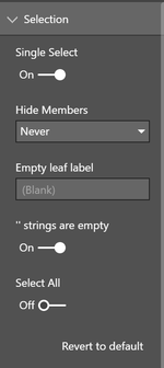 Single Select - When set to true only one member of the hierarchy can be selected. When set to false (default) a multiple selection is possible.
- Multi-select with CTRL - If turned on (default) multi-select is possible if the CTRL key in pressed while selecting.
- Selection type - Controls the type of selection:
- Standard - Each item can be selected
- Leaves - Only leaves (lowest items) can be selected
- Hide Members - Control if items should be hidden to support 'ragged hierarchies'
- Never - Never hide members
- Empty - Hide items if the value is 'empty'. See '' strings are empty option for additional options
- Parent Name - Hide items if the value is the same as the parent value
- '' strings are empty - When set to On both empty strings ('') and 'null' strings are treaded the same.
- Select All - When enabled there is a 'Select All' member the select (or deselect) all the available members.
- Select All Label - If the 'Select All' option is enabled this option can be used to alter the label of this member.
Header
Basic formatting of the header is possible in this section.
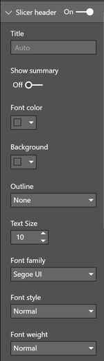 On/Off - Enable the header
- Title - Enter a custom header. If left empty the name of the first data field is used as title
- Show summary - Add selection summary to the title
- Font Color - Font color used for the header *
- Background - Background color for the header *
- Outline - Option to set the outline around the title: None, Bottom Only, Top Only, Left Only, Right Only, Top + Bottom, Left + Right and Frame
- Text size - Text size used for the header
- Font Family - Font Family used by the title
- Font Style - Font Family used by the title. Options are: Normal and Italic
- Font Weight - Font Weight used by the title. Options are: Light, Normal,Semi Boldand Bold
Items
Basic color formatting of the items
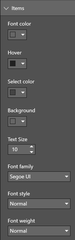 Font Color - Font color used for the items *
- Checkbox Color - Color used for the selection checkbox *
- Hover - Color use as font color is the items if 'hovered' by the mousepointer *
- Select Color - Font color of the selected items *
- Scrollbar Color - Color used for the color if the scrollbar *
- Background - Background color for the items *
- Text size - Text size used for the items
- Font Family - Font Family used by the items
- Font Style - Font Family used by the items. Options are: Normal and Italic
- Font Weight - Font Weight used by the items. Options are: Light, Normal,Semi Boldand Bold
Search box
If Search is enables via the visual menu (...) this option will be available to format the search experiance.
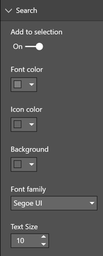 Add to selection - Enables the option to add the selection made via the search result to be added to the current selection. Only with multi-select enables
- Font Color - Font color used for the text of the searchbox *
- Icon Color - Color used for the icons in the searchbox *
- Background - Color used for the background color of the searchbox *
- Font Family - Font Family used by the text of the searchbox
- Text size - Text size used for the text of the searchbox
Zoom mode
Configuration of the 'zoom mode' that can be enabled by double clicking on the slicer title
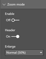 Enable - Option to enable zoom mode directly
- Header - Option to enable zoom mode via double tap/click on the title
- Enlarge - Define how many the slicer needs to be enlarges: 25%, 50% or 100%.
Tooltips
- Icon - Defines which icon should be shown to trigger the (report page) tooltips
- Information - Uses a small 'i' as tooltip icon
- Trangle - Uses a small trangle icon as tooltip icon
- Horizontal dots - Uses a three horizontal dots as tooltip icon
- Vertical dots - Uses a three vertical dots as tooltip icon\
- Icon Color - Color used for the tooltip icons *
Theme colors
The HierarchySlicer uses the colorpalette of the choosen Power BI theme, see:
| Color class | What it formats |
|---|---|
| firstLevelElements | Search / Header font |
| secondLevelElements | Item font |
| fourthLevelElements | Color of the scrollbar |
| foregroundNeutralDark | Item font when selected |
| backgroundNeutral | Linecolor of the selection icons |
| secondaryBackground | Search line color / Tooltip icon color |
| backgroundLight | Line color of header |
Limitations
The current version (v2.0) has the following limitations
- Visualize the slicer as a dropdown will not happen as the API doesn't support this
Changelog
See for the list of changes here.
Feedback
If you have any comment related to the documentation, like corrections, unclear features or missing documentation, feel free to leave feedback below via GitHub. Or correct it yourself and submit a PR; see CONTRIBUTING.md for more details. GitHub account required.