Power BI Box and Whisker chart
Introduction
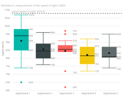 A box and whisker chart shows basic statistical information (five-number summary) of a dataset: the 1st and 3rd quartile (box), the median (line), the mean (dot) and dependent of the type either the minimum and maximum value or the 1.5x interquartile range [IQR] (whiskers).
Example
See here for an example if the embedded version is not working.
Data Fields
The Box and Whisker chart needs data is a specific way.
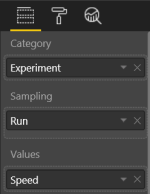 Category - This field contains the categories. For each ( unique) category a different chart is drawn.
- Sampling - All these fields are being used to 'sample' the dataset or 'creates rows'.
- Values - The values field contains a numeric value to calculate the statistic values needed for the charts.
Chart options
The box and whisker chart has chart option to influence the chart.
Quartile calculation
In general there are two ways of calculating the quartiles of a dataset.
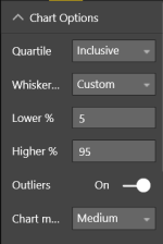 Inclusive - When calculation the 1st and 3rd quartile, the median is included in the calculation. Equivalent of the Excel calculation
 QUARTILE.INC()- Exclusive - When calculation the 1st and 3rd quartile, the median is excluded in the calculation. Equivalent of the Excel calculation
QUARTILE.EXC()
Whisker Type
This chart support four different types of whiskers
- Min/Max - The whiskers represent the minimum and maximum values of the dataset
- < 1.5 IQR - The top and bottom whiskers are set to the highest/lowest value of the dataset that are included in the 1.5IQR range.
- = 1.5IQR - The top and bottom whiskers are set to 1.5IQR of the dataset.
- Custom - The whiskers can be set to a custom percentile value based on the dataset. The lower value is bound to the lower percentile possible and 25%. And the same is for the higher value, but then from 75% and up to the highest percentile value possible.
Outliers
Option to enable is outliers should be visible, when available. This option is not available when the whisker type is set to Min/Max
Chart Margin
Option to set the margin between the different charts. Is ignored when data labels are enabled.
X-Axis
There are several options to change the default X-axis
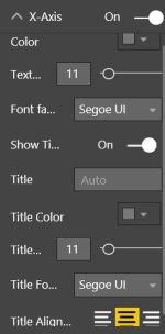 On/Off - Enable the X-Axis
- Color - Color used for the axis labels
- Text size - Text size used for the axis labels
- Fort family - Dropdown that contains different fonts that is being used for the axis labels
- Show title - Option to show or hide a axis title
- Title - The text being show as title. If none is provided the name of the Values is being used.
- Title Color - Color of the title
- Title Text Size - Text size of the title
- Title Font Family - Dropdown that contains different fonts that is being used for the title
- Title Alignment - Alignment of the title related to the axis.
Y-Axis
There are several options to change the default Y-axis
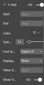 On/Off - Enable the Y-Axis
- Start - A custom start value for the axis. Cannot be higher that the automatic calculated minimum.
- End - A custom end value for the axis. Cannot be lower that the automatic calculated maximum.
- Color - Color used for the axis labels
- Text size - Text size used for the axis labels
- Font family - Dropdown that contains different fonts that is being used for the axis labels
- Display Units - Option to change the unit shown after the axis labels
- Value Decimals - Option to alter the amount of decimals used by the axis labels
- Show title - Option to show or hide a axis title
- Title - The text being show as title. If none is provided the name of the Values is being used.
- Title Color - Color of the title
- Title Text Size - Text size of the title
- Title Font Family - Dropdown that contains different fonts that is being used for the title
- Title Alignment - Alignment of the title related to the axis. Here left is at the start of the axis and right is the end.
Data Color
The chart can be altered by using different colors for different elements.
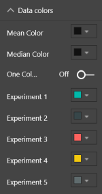 Mean Color - The color used by the mean dot for every chart
- Median Color - The color used by the median line for every chart
- One Color - Option to change the category coloring and enables a one color for every category. If enabled, the first category color is used for all categories and can be changed.
- Categories Color - Per category a different color is being used based of the default values of the theme. Each individual color can be changed.
Data Labels
Option to alter he default data labels.
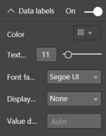 On/Off - Enable data labels
- Color - Color used for the data labels
- Text size - Text size used for the data labels
- Font family - Dropdown that contains different fonts that is being used for the data labels
- Display Units - Option to change the unit shown after the data labels
- Value Decimals - Option to alter the amount of decimals used by the data labels
Shapes
Option to show or hide the mean dot and median line.
Gridlines
There are different option to change the gridlines.
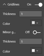 On/Off - Enable (major) gridlines
- Thickness - Line thickness of the major gridlines
- Color - Color of the major gridlines
- Minor gridlines - Enable minor gridlines
- Thickness - Line thickness of the minor gridlines
- Color - Color of the minor gridlines
Reference lines
With this version it is possible to add different reference lines to the chart.
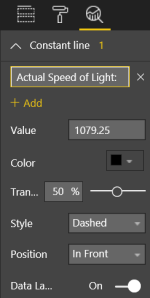 Name - Name of the reference line
- Add - Add additional reference lines
- Value - The value of the reference line
- Color - Color of the reference line
- Transparency - Set the transparency of the reference line
- Style - Three different style are available for reference lines: Dashed, dotted and solid
- Position - Option to show the reference line In front of the charts of behind
- Data Label - Enable a data label of the reference line
Reference line label
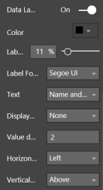 Color - Color of the label
- Label Text Size - Text size used for the label
- Label Font Family - Dropdown that contains different fonts that is being used for the label
- Text - Either choose to display the value, name or both as label
- Display Units - Option to change the unit shown after the label
- Value Decimals - Option to alter the amount of decimals used by the label
- Horizontal Position - Choose the horizontal position (Left or Right) related to the reference line
- Vertical Position - Choose the vertical position (Above or Under) related to the reference line
Changelog
See for the list of changes here.
Feedback
If you have any comment related to the documentation, like corrections, unclear features or missing documentation, feel free to leave feedback below via GitHub. Or correct it yourself and submit a PR; see CONTRIBUTING.md for more details. GitHub account required.